Pages

Showing posts with label color selection. Show all posts

Sunday, November 11, 2012

Basement Makeover

A few months ago I posted some Before pictures for a basement I was working on. Here are some reminders of what it looked like before I got called in to rescue this space.


It was dark! Did I mention it was dark? The floors were black, the ceiling was black, the paneling was dark brown and the stone walls were a nice 100 year old gray. 

The bedroom for the 12 year old son was just as colorful.


Our first course of action was to paint and paint and paint! Well, not me personally, but a great big crew of guys who looked at me like I was crazy when they saw the basement and asked, "Are you sure you want to do this? Maybe you should call it a cellar and walk away..." Fortunately, I'm pretty stubborn and I had a vision of how this basement could look!

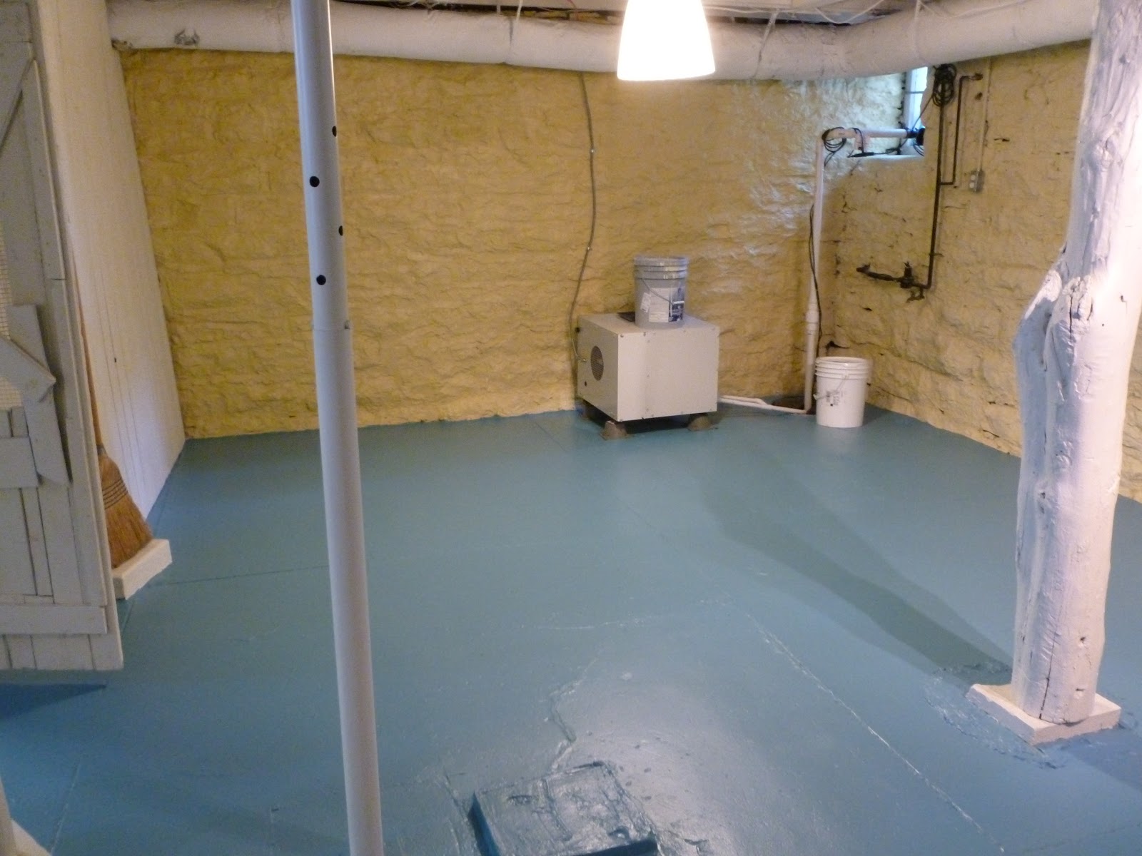

As you can see, the ceilings were painted white, the walls were painted a cheerful yellow, the floors were painted a fabulous blue and the paneling was painted a soft yellowish white. It looks like 20 lights were installed but it's just paint. 

Here are After pictures of the bedroom:


I rearranged the furniture and shifted the red storage unit and drawer unit in from the family room and installed a couple shelves to give him more storage. New bedding and artwork help brighten the room even more.


Now to the family room!

Quick reminder of the Before

Drum Roll Please!

The color palate stayed simple since there are so many different textures going on with the walls and ceiling. I flip-flopped the furniture placement so the tv area is more open and easier to access. View as you come down the stairs. I love it now!!!

The dining area is now where the tv used to be. I reupholstered the chairs with a bright cheerful print. The table in the background was made by the homeowner and his son so this sentimental piece needed to stay. It is now a great place to sit and do homework! 

The youngest member of  the family (5 year old boy with a hilarious personality) has claimed the area behind the futon as HIS play area! So keep out.


 Matching rugs unite the two areas, cream slip covers give new life to furniture, and an Ikea Expedit holds games, toys and videos. 

The whole family loves spending time in the basement now instead of avoiding it like the plague  I hear there has been a Little House on the Prairie movie marathon weekend enjoyed by all in the new and improved basement!

I would like to give a special thanks to my friend Karen Reinsch for taking the After pictures for me! Check out her photography blog HERE. 


Paint colors/products used:
Dry Fall in white on the ceiling
Sherwin Williams, Classical White on paneling
Sherwin Williams, Manitou Blue on floors
Virginia Limeworks, Washed Sand (a lime paint) on the stone walls

Thursday, October 4, 2012

Long Overdue!

Finally. I painted my awful cabinets! 


I have wanted to paint my kitchen cabinets since the moment we owned the house. (I'm not going to tell you how long ago that was!) I have had a paint swatch tucked in a cabinet door for 2 years but I would forget all about it until someone would see it and ask, "Oh, are you going to paint your cabinets??" Yes, last year and the year before and the year before... 

The golden oak color has been out of date for years and made the kitchen seem dark, small and very ugly.


I found out about a Benjamin Moore product that goes on like a latex and cleans up like a latex paint but dries and is as durable as an oil paint. It is called Advance and I am SO pleased with how great it looks and how easy it was to use!


I love my kitchen now! I know it will never be on the cover of a magazine but it is wonderful nonetheless. It is bright. How bright, you ask? It is so much brighter I keep coming around the corner thinking I left the lights on and then realize it's all that elbow grease and white paint that brightened the place up.


I'm leaving the upper cabinet doors off for now because my life is so busy that I can't be opening and closing all kinds of doors! (Brian Regan reference). Actually, I do really like how open it feels but the long term plan to take out the center of the doors and add glass panels. Maybe I should put a time limit on that project!

I used to have big bulky blinds in the window but decided to take them down and go with something airy and bright. In steps ivory lace to the rescue! 


Now that my kitchen and I are on speaking terms, I'm pulling out my pretties that have been boxed up for years because they just didn't quite "go" with the kitchen before her makeover.


Now as I sit at the table drinking coffee while one child does artwork and the other drums for the entire Star Wars collection, I can enjoy looking at my lovely kitchen (and then get up and go find my ear plugs).

Boob lights, watch out. Your days are numbered.


Cabinets are Bejamin Moore Acadia white
Back wall is Benjamin Moore Woodlawn Blue
Walls are Clay Beige with green added to take out the pink so it is much closer to Nantucket beige.


Thursday, June 28, 2012

Bye bye dungeon

My current project is the basement of a 100 year old house.  The rest of the house looks amazing but the basement looks 100 years old and needs some help!  We are almost done with painting and then this weekend I'll load all the furniture and decorations.

Here are some Before pictures


Any light was absorbed by the black ceiling and black floors.


The basement had become storage for odds and ends that weren't needed in other parts of the house.

Typical teenage boy bed!  


A bathroom was eked out of a small corner in the basement and we are going to do what we can to improve it and provide more storage.  Unfortunately, I can't move duct-work or pipes!   

This has been an intimidating project and I admit my stress level has been pretty high this week but by taking it piece by piece I've broken it down into a manageable project.  This re-do has also included a lot of research on historic masonry and we are going to use a product on the stone that I've never used before.  It's called lime paints and the company is Virginia LimeWorks.  Check them out, there are some amazing products for historic restoration AND new builds!

Stay tuned for the After photos!

Tuesday, May 8, 2012

update or allowance?

I recently had the privilege of doing a Home-Staging consultation for a family in Fairview, TN.  Their home was on the market for a year without any luck so they pulled it off and are now re-listing it.  They agreed to have a home-stager come out for a consultation (provided by the Realtor, so who would refuse??) but were a little surprised at a couple of my suggestions.  Here is the kitchen as it currently stands-


What would you think when you walked into a house with this kitchen?  Is it appealing to you?  What do you like/dislike about this kitchen?  A friend of theirs suggested giving a "kitchen allowance" so home buyers can do updates.  What do you think?  Allowance or updates?

Here is more what I'm picturing for the kitchen.  I wouldn't change layout but I think the cabinets need to be painted, walls need to be painted and countertop needs to be replaced.


As we all know, kitchens and master bathrooms are really important so besides the recommendations I offered for the kitchen, I also want them to focus some attention on the master bathroom. Here it is now-


The tub and the shower line the wall and since the shower has no door, it is basically a wall of fabric.  My first suggestion for this bathroom is to get a new shower stall that has a door.  The bathroom will seem bigger and a shower with a door is much more practical anyway.  I'm thinking that once the shower is redone then the shower curtain in the tub can come down because it doesn't need to function as a tub AND a shower.  Thoughts?


My second suggestion is to paint the vanity.  Right now it looks old and dinged up.  Aaaand, the wall color should be addressed, too, because this orangey brown isn't a color that will appeal to a broad audience of people.  I'm not saying it has to be beige, but it needs to be current.  Benjamin Moore Yarmouth Blue or Palladian Blue would be a lovely colors.

Here's an idea of what the vanity will look like once it's painted.
This bathroom vanity looked JUST like the one in my client's house.  Here is a link to their  pictures.

Sometimes rearranging furniture is enough to stage a home but sometimes there are some bigger projects that should be tackled so a home feels updated and welcoming.  As a home-buyer, what do you prefer?  Updated home or a redecorating allowance?


Sunday, March 4, 2012

Primary Colors

Today's June Steckler Image Challenge is Primary Colors and I have enjoyed seeing all the pictures that have been posted so far!  My favorite bracelet right now is a beaded bracelet from Noonday Collection and I absolutely looove all the colors.  It goes with just about everything I wear and is so bright and cheerful that it is impossible to wear it without absorbing the cheeriness.  


Wearing a bracelet with bright colors is a lot like how I decorate.  I usually avoid primary colors on walls but absolutely love using them in art and accessories.

source
In this room, the designer made modest color choices on the wall but used bold colors in furnishings and accessories.  


the more bright colors in decorating the apartment you How to Create a Bright Apartment With a Variety of Colors
source
I love how the pale blue walls are brought to life with the yellow and red accents.  


 I have to put in a room that I think looks great in the picture but in reality would give me a horrible headache.  This designer chose to use the bold color on the walls and use neutral furnishings.  I like bright colors but a whole room in this yellow is too much for me!


If you just aren't sure how to inject some color in your house without overdoing it, you may want to consider this interesting piece of furniture!  Someone saw my bracelet and made it a couch.


 Bright Color Scheme for Multifunctional Sofa Design
it actually available!


Friday, December 2, 2011

Organized and Fabulous

I am so excited to post After pictures of the office I recently finished!  When my client first asked for help, she told me she would shudder and close the door when she walked past the office because it was such a mess and the paint color was just plain wrong.  


You can almost tell that there is an amazing fireplace in this room with a gorgeous tile surround.  The paint color, though, was so bright that it dominated the entire space.  Instead of a file cabinet, there were 6 or 7 small file boxes and several other insufficient shelves filled the room but didn't help with the storage problems.  

This room gets so much light that with the sunlight bouncing off the walls this color was overwhelming.  My client still wanted a green color in the room and I had an idea that I thought would be great~ without detracting from the beauty of the fireplace.


The foundation of this room was organization.  Getting this closet organized and functional was incredibly important!  Thankfully with The Container Store in town, I was able to get a great closet system in place that provides plenty of storage and more than enough function.


A file cabinet now takes the place of all the small file containers that cluttered the room.  I kept 1 for the legal size documents but as you can see, there is plenty of room for it on the shelf and there is no need for it to take up floor space.  Everything is labeled and easy to find.


The fireplace in this room is gorgeous and was our color inspiration.  


I chose a much more grey version of the tiles and picked a neutral taupish grey for the lower portion of the walls.  I chose a desk with a glass top so it isn't too bulky in this small room but it does provide more than twice the amount of  surface space.


The mantle is kept simple with 1 piece of artwork, mercury glass votive holders and some personal accessories.


A cohesive color scheme keeps the room from feeling cluttered.


The fabulous cabinet from Nadeau houses cds, dvds, records and medical binders.  Who says a printer stand has to be ugly?  


A relaxing reading chair that was once covered in files and tucked in a corner now has the perfect home and I'd say the room is done!  


From Chaos and Kindergarten colors


To sleek, sophisticated and functional


To see more about the closet organization from this project, click HERE

If you've got a room that is covered in storage containers yet no organization in sight, contact me and we can transform your home into a functional beautiful space.


Friday, September 30, 2011

My Green Door

I posted a while back about trying to decide on a color for my shutters and front door.  You can see that post Here.  I really wanted to use green but the color green I was drawn to just didn't seem right for the shutters.  SO, I painted the shutters black (paint I already had in the garage) and painted the door green.  This way, I can change the door color as the mood strikes me and the shutters stay their crisp, practical black.  
Here is a quick reminder of the Before-
Faded burgundy shutters and door, dirty gutters and windows.  The place was depressing!


I used the color Grassland from Lowe's.  Once we got up on the ladder to take the shutters down we washed the windows and gutters so the house looks squeaky clean now, which definitely needed to happen!


Now to finish off the landscaping on the left side of the house and it'll be my perfect little cottage.... until I decide to change something else!  Total cost for this makeover was $15.  


Need to make some changes but don't have much budget?  I absolutely love those kinds of projects!  Let the creativity begin....