Pages

Sunday, February 27, 2011

A bookshelf makeover

This isn't going to be a jaw-dropping before and after but I always like to see and share pictures of makeovers -however small they may be!

My friends gave me a couple bookshelves when I created a design plan for their office/gear room.  The bookshelves are handmade and although very sturdy, they weren't very cute.  I always imagined I would paint them fun colors but didn't get around to it....until I noticed that their daughter might benefit from a bookshelf in her room!  I was very open and honest that I was going to re-gift the bookshelf, hoping that that would make it less tacky.  (remember that next time you get a hideous sweater at Christmas....tactfully re-gift it as coasters!  ha ha!)   I painted the bookshelf for their daughter and it is perfectly adorable in her bedroom.

 Not much of a looker, bless its heart.  I sanded down the interior and exterior of the bookshelf to break down some of the glossy poly that covered the shelf so the paint would adhere better. 

 Next, I primed the interior of the bookshelf and then painted with semi-gloss Great Green (sherwin williams).  Since there is a lip around the front of the bookshelf it was easier to keep the line between the two colors nice and tidy.  Creating a line between two paint colors can be tricky so I lucked out!

For the exterior I used Silky White in the Behr paint and primer in one. Two coats of poly and we are ready to go! 
Some books and accessories and it is ready for use.  Now that my original vision has been realized for one of the bookshelves I need to apply some elbow grease and get the other one done for my son's room.  I just love how a little paint can give furniture a new lease on life!  

Thursday, February 24, 2011

Little L's nursery

Before my second son was even born I knew he was going to be busy (he was a wiggle worm!) and that he would need a fun nursery to match his energy.  Once again, though, small house proportions meant it would be too easy to overwhelm and dominate with a bright color so I chose... white.  :)  Filled it in with a deep pumpkin color and fun bedding.


Almost everything was in my older son's room when he was a baby.  The Ikea crib, Ikea shelves, garage sale dresser (repainted) and the rocking chair.  


I made the mobile using paper lanterns, a knitting hoop and fishing twine.  I wasn't super pleased with my first attempt that you see in the first picture so I re-worked it by painting the large white lantern and hanging the smaller lanterns in a different pattern.

The stripes are actually NOT painted, they are peel n' stick stripes that I picked up on clearance at Lowe's.  It is a super easy way to bring some fun into the room without making a big painting commitment.

My son is 2 now and it's almost time for a big boy bed!  I think I'll bring more yellow into the room when we make the transition because his disposition is so sunny!  It just seems like the perfect color for him.

Wednesday, February 23, 2011

My living room

My living room is the first room people see when they enter my home.  I wish I had fabulous flooring to go with the first impression but that is a project that is WAY down on the list of things to get done.  Recently I repainted the living room, de-cluttered and am still working on the final touches.


The stripes are painted with Sherwin Williams colors Antique White, Kilim Beige and Nomadic Desert.  I wanted neutral but not boring.  The stripes keep it interesting but don't dominate the room.

I struggled with the artwork over the couch.  You can see the progression here. I finally found a couple prints that are supposed to be hung vertically but I hung them horizontally and flipped one upside down!


In a small house it's easy to over accessorize and make it feel cluttered.  I prefer to focus on a few large accessories and add just a few smaller ones here and there.  

My bedroom

Our bedroom is tiny.  I don't spend much time in it so I guess I don't really need a big room but the size did present a challenge when it came to placing furniture!  I arranged the room several ways before I decided to use trickery to make it look good.

 The curtains cover most of that wall and they hide the fact that the bed and window are not centered. The window is centered on the wall but the bed is centered on the usable wall space.  As you can see below, there is a door that has to be taken into consideration!


A soft gray is a sophisticated background for the cream/black color scheme.  I love the metallics throughout and always smile when I see the bright whimsical bench that is the pop of color I need.  Small spaces don't have to be boring!

Monday, February 21, 2011

Near and Dear

As I welcome myself back to blogland after a hiatus brought on by sick kids, I am excited to share one of my favorite projects of all time.  A room re-do for the sweetest Grandma I've ever met!  My husband's Grandma to be exact and it was a surprise re-do while she was in Branson seeing her favorite singer, (besides my husband, of course) Daniel O'Donnell.

Grandma lives in a small 2 bedroom house but one of those bedrooms wasn't even usable.  It was dark, dated, dirty, full of stuff and poor embarrassed Grandma kept the door closed at all times.  After a renovation that -thank the Lord- brought her washer and dryer out of the basement we decided it was time to do something about that room!


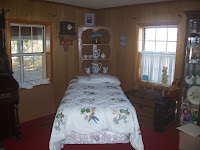
After the renovation the wall was left as you see it.  

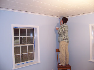
The To Do list for the room was pretty long but we jumped in and in  1 weekend got it done.  We ripped up flooring, shoveled out the carpet pad (yup, that's how old it was), paid someone else to install new carpet, tore down the ceiling, installed a new ceiling and painted.  Lots of painting! 


I was about 4 months pregnant at the time of our surprise re-do so I wasn't allowed to paint but I kept myself busy doing the sewing, cleaning the rest of the house and bossing everyone around.  :)

We primed the walls with tinted primer and since there were 2 types of paneling we filled in some of the deeper grooves on half the room before doing the top coats of paint.  My wonderful sis-in-law, Melodie did most of the painting and did a fabulous job!   


Grandma had some gorgeous furniture that we were able to bring to life by lightening and brightening the room.  I love the finished product and it's one of those rare instances when I get to see the "after" again and again. Also, blue is her most favorite color in all the world and she said she loves to leave the door open now so she can enjoy her pretty room.

 I gave the guests more privacy by hanging longer cafe curtains in the windows AND still gave Grandma plenty of room to see out the top.  

Her beautiful hand painted pottery is featured in the nook. A lovely tribute to the wonderful creative woman she is.  


 Her amazing antique organ finally stands out instead of blending in with old paneling!  (We had wrapped the door in streamers and bows for her arrival :))


Sweet Grandma, home from Branson, shocked and amazed that her grandkids love her so much to spend their time and money making her house a little prettier. It is a wonderful memory for all of us!

Wednesday, February 9, 2011

Iron craft challenge 6: Winter

When I think of winter I think of staying inside bundled up under cozy blankets, reading a good book and sipping a mug of hot tea.  If I had my druthers I would stay that way all winter- only venturing out to buy more tea and get more books from the library.  I am a winter hibernator!  Skiing? Ugh, no.  Sledding with the kids?  Only if I must.
 I like to be warm!
So, when the iron craft challenge was posted I immediately thought of warms drinks.  You know me!  How to make that thought into a craft, though?  I decided to make a Drink Station inspired by winter.


Step 1: Off to a good start, huh?  Don't worry, I have a vision for these amazingly awful 30 yr old prints from the thrift store. $2 is right up my alley!


Step 2: I took the cardboard print out of one of the frames and placed my hooks.  


Step 3: I used decoupage to cover the frame in pretty paper.  I liked the added interest of the red in the middle and you'll see what I chose for the backing!


Step 4: I painted the second frame but left the artwork intact.  There is a much brighter future here so don't lose heart.  (my apologies if you like the cardboard artwork)


Step 5: I added my hooks, backer, snow/glitter and a bird to the first frame (seems fitting that my space- heater is discretely sitting in the background!).  Finally, added my cups and hung it up!


Step 6: I painted over the print in the second frame with chalkboard paint.  Just about ready....!


Step 7:  I used picture wire to string curtain clips that can hold a variety of beverage options across the message board.  ( all that's lacking is a place for some whiskey)


 Voila!  Add a little message and the drink station is ready!  


Monday, February 7, 2011

Iron craft challenge

In order to keep the creativity flowing while I spend my days laughing with my children I have decided to take up crafting.  theironcraft blog has weekly challenges that keep me crafting and keep me creative.  This week the craft inspiration is WINTER so I'm working on my creation.  Every time I make something I think, "Someone with better crafting skills could make this look a LOT better than me," but I keep working anyway.  I'll post pictures on Wednesday and that reminds me, I need to get to work!  eeks!

Also, later this week I'll post a link to a friend's blog.  Matt asked me to guest write for him and I have been stressing for months over it.  It's done and I hope you enjoy it!

Friday, February 4, 2011

Think outside the box

I heard the phrase "migratory furniture" recently and laughed so hard because, I must admit, my furniture migrates pretty regularly and it soothes my soul.  Sometimes it is simply the realization that the couch would look much better on the other side of the room and sometimes it is the need to shake things up a bit.  This is my first winter cooped up with 2 young and very active boys so as the cold drags on I've been unable to ignore the need to lighten and brighten my surroundings.  AND, not spend money.

Yesterday as I was sitting at the table in the dining room I looked out onto the deck and felt sorry for the table out there.  Stuck in the cold with no one to enjoy its style.  I looked at the big black table in front of me and realized I could make a huge impact with very little effort and NO money!


The glass-top table takes up so much less room, it reflects a ton of light and the room feels so much livelier without the big black table dominating the room.  (plus, I get to sit closer to my family at meal times)  


Side note: my buffet used to look like THIS but I decided to change it up a bit.  I used a strip of grass-cloth wallpaper that I bought for about $5 and taped it to the doors.  Much better!  I like modern lines but love natural textures so this solution marries the two preferences perfectly.  And, yes, those are cheap Ikea chairs with washable cushions for my kids.  Sometimes practicality has to win over style.  Maybe when they move out I'll bring in my other 2 animal print chairs!

Now my old table is in the garage with no one to enjoy its style but, well, life is rough sometimes.  Feeling the need for change?  Don't bother rushing to the store; Just try rearranging a few things and thinking outside the box! Happy migration!

Wednesday, February 2, 2011

A Mistletoe Valentine

Here's a fun little Valentine craft.  It's also one I actually made myself!  Believe it or not...

My friend Amanda mentioned a craft challenge at theironcraft.blogspot.com/and suggested I join the ranks of those trying to be creative and crafty!  So, this week's challenge is to make a Valentine and I decided to make a Mistletoe Valentine.  Fun and easy (how I think ALL crafts should be... but not all ladies -wink!)

I also entered this in a contest Valentine's Day Challenge so please leave comments!  They are my "votes" and I need votes to win!

I started out by cutting out 6 large hearts and tried to keep them as close to the same size as possible.  Anyone can do this part!

Next, I decorated each heart and strung some ribbon through each end.


this one says "meant to be" and "all you need is love"


This project is perfect for indecisive people!  You basically get to make 6 Valentine's cards for 1 person!


Knot all the ribbons together and what do you get?


The cutest most adorable Mistletoe Valentine.  Think my hubby will like it? ;)


disclaimer:  Usually I roll eyes at Valentine's day but I'm feeling the need to embrace any chances at creativity.  Happy crafting!

Tuesday, February 1, 2011

Valentine's Day inspired crafts

Well, it's February.  Time for pink, red, hearts, chocolate, candy, paper doilies and love.  Lots of love.  I found some super cute craft ideas to get this month kick-started!

This crayon heart sun-catcher is just what we need to brighten up the dreary days of winter.  Click here to view directions for making this adorable craft.
Crayon Hearts

This craft is fun and easy!  Click here for directions.
Sweet Spot Hearts

I got excited when I saw this one.  Definitely going to have a bouquet of these for the boys on Valentine's Day!  Click here for directions.


I saw this idea on a blog and thought it was chic, clever and SO simple!  Not so much a craft for the kids but it would still be fun to create!  The link to the creator of this idea wasn't working but I'm pretty sure it's just a heart wrapped in twine.  Might be a little time consuming but well worth it!


BUT, if you are like me and want to keep it super simple just cut out hearts from fun colored scrap paper, get out some glitter, find some stickers and have some fun!


This is my friend, Vanessa's daughter.  Click here to see her highly amusing blog!  Fun and easy and a great way to start the heart obsessed month!  (fyi, glitter defies the suction of vacuum cleaners!

Happy Crafting!