THE BEDROOMS
Before: The master bedroom of this house was also the office but the furniture layout gave absolutely no separation of the two. It was a large room but the space wasn't used very well.
After: We rearranged furniture (separating the office area from the sleeping area), changed the bedding, added curtains and took out the outdated over sized headboard.
Before: It's great for kids to have hobbies and interests and for their rooms to reflect that but when your home is on the market it is best to scale back and represent those passions simply. This room was really small and seemed even smaller because you would trip over the bed when you walked in the room. Time to rearrange!
After: Once again, we rearranged furniture and added curtains. We also took down the horse border and the 1 small piece of artwork on the walls. It is better to have bare walls than something that is too small and awkwardly placed.
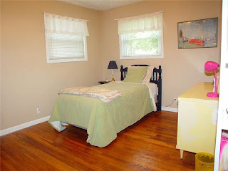
Before: This bedroom was so sad and bland! Clutter on the floors had to go and some life had to be brought in so buyers can imagine their children being at home there.
After: We brought in a headboard for the bed, cheerful but neutral bedding, artwork and changed the floor plan. We even brought in an armoire from the living room (unfortunately, I didn't get a picture from the other side of the room so you can see it) to give her more storage and with the new layout, it works perfectly!
So, you can see that with space planning and simple changes a huge impact can be made in your home! I love how much we were able to do without spending much money.


0 comments:
Post a Comment