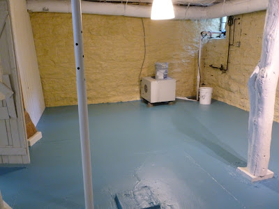
A few months ago I posted some Before pictures for a basement I was working on. Here are some reminders of what it looked like before I got called in to rescue this space.
It was dark! Did I mention it was dark? The floors were black, the ceiling was black, the paneling was dark brown and the stone walls were a nice 100 year old gray.
The bedroom for the 12 year old son was just as colorful.
Our first course of action was to paint and paint and paint! Well, not me personally, but a great big crew of guys who looked at me like I was crazy when they saw the basement and asked, "Are you sure you want to do this? Maybe you should call it a cellar and walk away..." Fortunately, I'm pretty stubborn and I had a vision of how this basement could look!
As you can see, the ceilings were painted white, the walls were painted a cheerful yellow, the floors were painted a fabulous blue and the paneling was painted a soft yellowish white. It looks like 20 lights were installed but it's just paint.
Here are After pictures of the bedroom:
I rearranged the furniture and shifted the red storage unit and drawer unit in from the family room and installed a couple shelves to give him more storage. New bedding and artwork help brighten the room even more.
Now to the family room!
Quick reminder of the Before
Drum Roll Please!
The color palate stayed simple since there are so many different textures going on with the walls and ceiling. I flip-flopped the furniture placement so the tv area is more open and easier to access. View as you come down the stairs. I love it now!!!
The dining area is now where the tv used to be. I reupholstered the chairs with a bright cheerful print. The table in the background was made by the homeowner and his son so this sentimental piece needed to stay. It is now a great place to sit and do homework!
The youngest member of the family (5 year old boy with a hilarious personality) has claimed the area behind the futon as HIS play area! So keep out.
Matching rugs unite the two areas, cream slip covers give new life to furniture, and an Ikea Expedit holds games, toys and videos.
The whole family loves spending time in the basement now instead of avoiding it like the plague I hear there has been a Little House on the Prairie movie marathon weekend enjoyed by all in the new and improved basement!
I would like to give a special thanks to my friend Karen Reinsch for taking the After pictures for me! Check out her photography blog HERE.
Paint colors/products used:
Dry Fall in white on the ceiling
Sherwin Williams, Classical White on paneling
Sherwin Williams, Manitou Blue on floors
Virginia Limeworks, Washed Sand (a lime paint) on the stone walls


