Pages

Friday, October 22, 2010

as luck would have it

I had been searching for a good deal on solid wood dining room chairs-with a cushion seat- for MONTHS and finally stumbled across my diamonds in the rough in rural Indiana.  Leaving my mother-in-law's house we drove past a house having a garage sale and I could see 4 chairs balanced precariously on a hill so we made a quick U turn and I braved a ferocious Pitt Bull to get a closer look.  Perfect.  I bought all 4 chairs for $20 dollars!  I still squeal when I think about what an amazing deal I got!

I also got more than I bargained for.  The crackle finish on the chairs would not be sanded down so I had to resort to toxic paint stripper.  Ug.  What a messy dangerous job!  Can I just say that it is never as easy as the can tells you it will be!


Finally, the chairs have realized their potential and I love them.  It's amazing what a little elbow grease can do!

Here are 2 of the chairs in my dining room.  Yes, I make my kids sit in cheap Ikea chairs with washable cushions.  Hey, it's better than using plastic seat covers!

side note: the buffet is an Ikea buffet that looks fine as is but I wanted to give it a little more character.  I found a sheet of grass-cloth wallpaper and taped it to the doors (yes, taped..that way, I can change my mind and have very little work to do!).  

Tuesday, October 19, 2010

Master bedroom update

To me, the master bedroom should never be ignored but it is usually the last room in the home to get attention since it is rarely seen by company.  The master bedroom should reflect the personality of the couple and be a refuge at the end of a long day.

Before:
Colors from the mid 90's and over the top floral curtains were just too painful for the home owners.


After: The home owners love earth tones so we got rid of the old and brought in the new.
Having never decorated for someone who is 6'5" I found myself having to negotiate with the husband the placement of artwork and accessories.  Above the bed?  The trickiest placement of all, for sure, but we compromised so it's high enough that he doesn't bump his head and low enough so his 5'4" wife can see what's on the shelves. 

The home owners love the accent wall!  It's actually the same color as the chair but looks brighter with the flash.  We brought in the earth tones they love, streamlined the curtains, simplified accessories and they finally have a room that reflects who they are.

What does your bedroom say about you?

Monday, October 11, 2010

a tale of two tables

I absolutely LOVE the Svala table and chairs for kids from Ikea!
SVALA Children's table  Length: 23 1/4 " Width: 19 5/8 " Height: 19 5/8 "  Length: 59 cm Width: 50 cm Height: 50 cm
It is a blank canvas that can be personalized in ANY way.  Here are two examples of ways I have painted the tables/chairs
the medallion in the middle of the tables is an abstract of the home- owner's last name.  Can you see Miller?   

This is perfect for little boys!  They love choosing which mode of transportation to sit by - learning to associate the word with the picture is an educational  bonus.

So fun and easy to personalize these tables and chairs!  Who's next??

Sunday, October 10, 2010

Passion for Playrooms!

Ok, so I'm a big nerd and enjoy designing playrooms!  I also like washing dishes (you wouldn't guess it if you saw my kitchen, though).  Strange, I know, but think of it this way... you get to see results quickly!

Before: 3 kiddos means many toys, means many messes, means hard to keep clean, means HELP!


Even I felt a little overwhelmed walking into this room and I know how to break a project down into manageable tasks!  Any previous attempts at organization in this room had, unfortunately, failed- despite good intentions.  A large tv armoire was packed with books, toys and a very small tv.  It took up way too much space visually and wasn't a practical storage solution.  The other storage solutions were bins that were too large so if one little car was wanted, the whole bin was dumped out.  Time to rethink the room completely!

After:  We used storage systems from Ikea (one of my favorite stores) to divide the room into play zones.  This half of the room has kitchen, dolls and dress ups.  The Trofast benches are easy to assemble, easy to configure to fit the room and easy for kids to use.


This half of the room houses the outdoor toys - in another Trofast bench- and the art corner.  The storage unit they already had is perfect for art supplies.  The bins are just the right size for markers, crayons, coloring books, play-dough, paints, etc.


The middle of the room showcases artwork from each of the children, houses books, dvds and more toys.  This is the Expedit from Ikea and two more flank each side.  Each toy bin is labeled so the children can clean up after themselves... and believe it or not, they do!

With a little more planning and a lot of sorting, any playroom can be a great place for the whole family to hang out and you won't have to lock the door when company is coming over.
Send me pictures of your playrooms and I'll help you make some changes that could make a big difference!

Saturday, October 9, 2010

A touch of Whimsy

This is actually my own bedroom!  It is really small but it is filled with details that I love.


One of my favorites is a thrift-store find that I transformed by painting and reupholstering.  Before: this little bench was not living up to its colorful potential.  I knew it could be the perfect addition to my black/cream/grey bedroom.


I love the unexpected burst of color and pattern!  It makes me smile every time I see it.


It is so easy to transform pieces of furniture with paint and fabric.  See if you can find something in your home that needs a new lease on life!

Friday, October 8, 2010

Playroom- fun and functional

Playrooms can get out of control pretty quickly and need a good organizational plan.  Choosing the paint color is also really really important!  It needs to be fun but you don't want it to over-stimulate the kids, which will create a negative atmosphere instead of a fun comfortable place to play.

Before:  The play room didn't have any color or adequate toy storage.


After:
I slaved over the stripe in this huge room!  Imagine starting in one corner, using a laser level to tape off a line but somehow ending up 2 inches off from the original starting point.  The colors I chose are appealing to kids and adults so no one dreads hanging out.  Fun but not overwhelming. 


A fun project for me that created a fun play environment for a fabulous family!

Wednesday, October 6, 2010

innovative thinking

Green is such a common phrase nowadays.  Most of us are very aware of what it means to be eco friendly, but would you be willing to take it all the way?  Here are some homes that are made out of shipping containers and recycled materials!

light in the window of a shipping container home


Mobile Dwelling Unit

The Ecopod


Redondo Beach House


Ross Stevens House


These homes just blow me away!  What creativity!

Tuesday, October 5, 2010

A long lost living room

The main living room in this big ol' house was lacking warmth and style. The built-ins were the wrong scale for the room and didn't provide enough storage or function.  The color was too mauve and the carpet had speed bumps.  It was hard to arrange this room since the fireplace and tv were on opposite walls but both were used regularly.
Before:


During:  The carpet came up, the old fireplace came out, we installed a vent free unit and a new paint color went on the walls. 


During:  The custom cabinetry went in.  This was a test in my self-confidence for sure!  I designed the cabinetry and gave the design to a very talented carpenter.  After he looked it over he kept saying, "I've never  seen anything like this...are you sure this is what you want?"  I stuck to my guns and think it turned out very well.

The mantle doubles as component storage and hidden hinges hide the fact that the front is actually two doors
 The area under the stairs now has TONS of storage for movies, cds, books and photo boxes.


After:  Gorgeous flooring, custom cabinetry, lots of storage and lots of style.  What more could a living room want?


Before: We even took out the wall of the dining room to open it up to the rest of the house.


After:


Monday, October 4, 2010

A house with a view

The first time I visited this home I paused for several seconds by my car just to take in the view.  Gorgeous!  Once I got inside, though, it was a different story.  I could tell the home-owners had beautiful furniture and accessories but they needed help putting it all in the right places.


Before: When you enter the home the dining room is immediately on your right separated from the entry by columns.  It was dark and over furnished.  I gave the home-owners quite a To Do list but they were receptive and got it all done!

What should be the formal sitting room greeted you when you turned to your left.  The clutter is a big No No when putting your house on the market.  Buyers need more help visualizing actually living in your home.


After:  A little bit of wallpaper removal and some paint can go a  long way!  The dining room feels inviting and about twice as big (we took out several small tables and a very large grandfather clock).  It is now a proper first impression.


The formal sitting room is now a sitting room!  We used furniture from other rooms in the house to pull this together.  Sweet and simple.  We also took down the large formal drapes since they were way too overpowering.


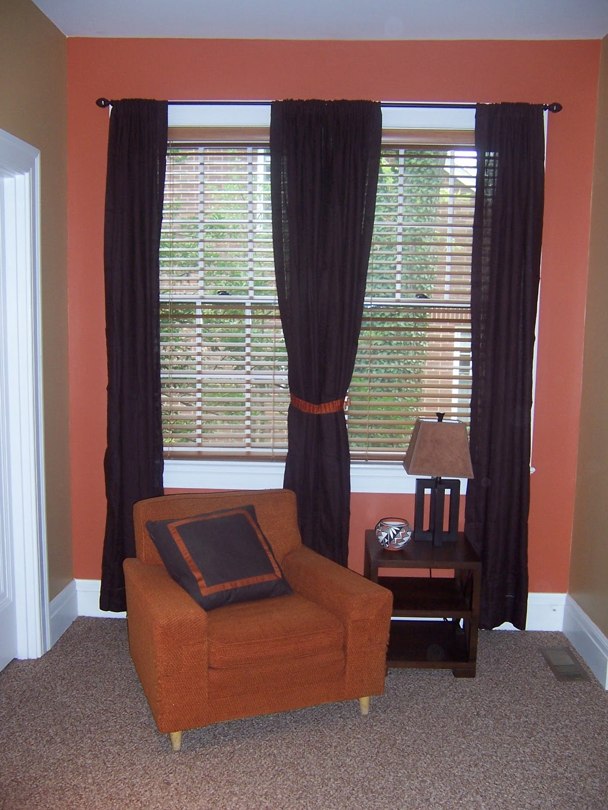
Before: The family room seemed worn out and the custom drapes blocked way too much of the view.


After:  I simplified the decor, had all the drapes taken down and re-worked the furniture arrangement.


Before: The kitchen was well on its way too being market ready but once again... too many curtains.


After: A new bask-splash and some accessories finished it off


Before:  The hallway bathroom had a busy and shiny wallpaper


After:  We had the wallpaper taken down and now buyers won't see "project" when they see the bathroom


Before:  The master bedroom looked really good but had too many pictures and heavy drapes that darkened the room and made the colors of the wallpaper too defined.


After:  We took down the drapes and simplified accessories


Before: Master bathroom


After: I wasn't able to get the wallpaper down but by streamlining accessories I was able to give the bathroom the feel of a spa.   


Before:  The office was cram packed with furniture.  Can you tell there is a large window in here?


After:  I moved the chair and ottoman to the family room, put the large filing cabinet in a niche, moved the desk and voila!  The room is bright, airy and spacious!


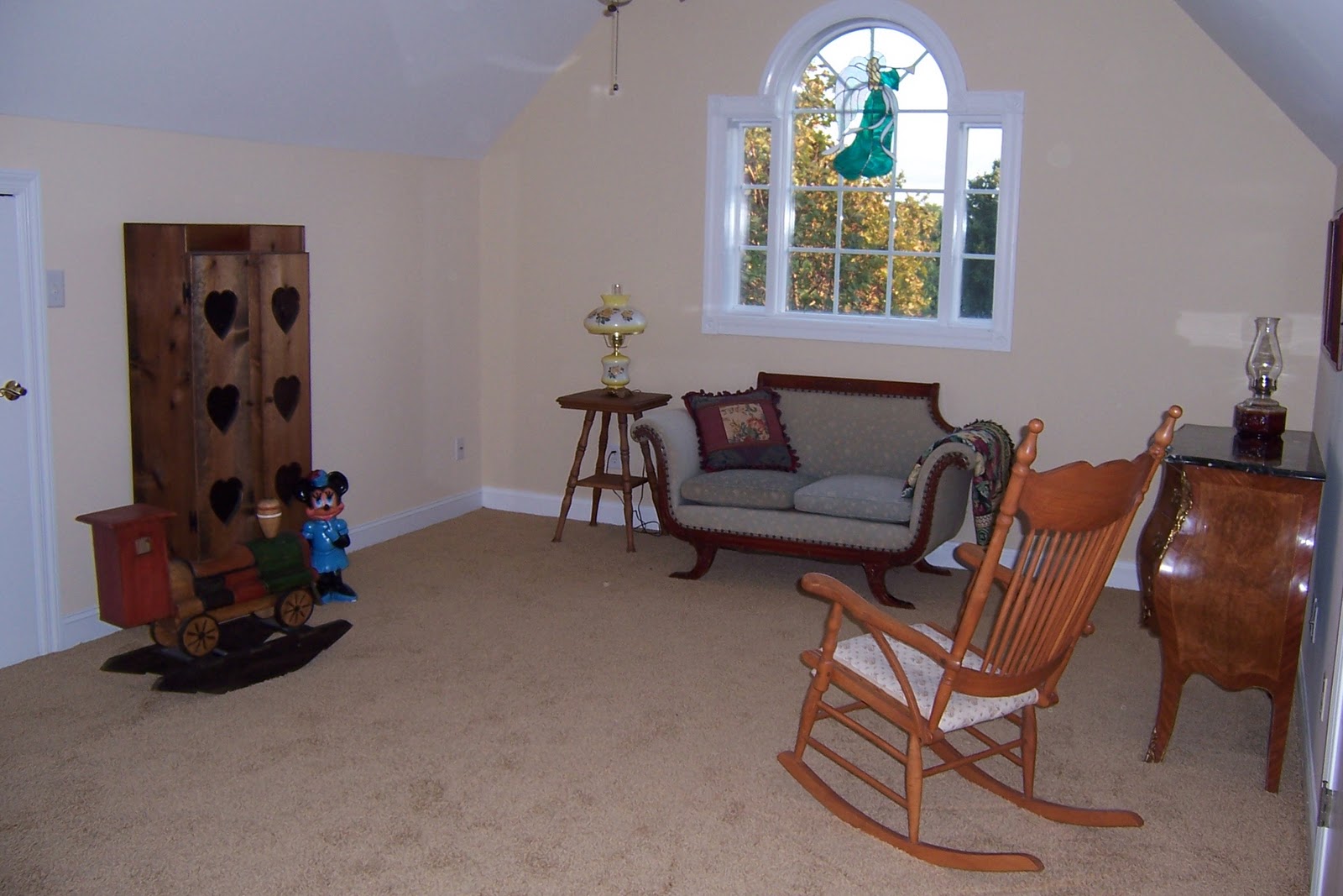
Before:  The bonus room was a hodge-podge of stuff


After:  We took out the air mattress and the table and chairs.  The room still has a purpose but buyers won't be distracted by too many functions.


Before: The guest room.  Over furnished and outdated.


After:  I took out the un-needed furniture, brought in accessories that were the right scale and I updated the bedding but kept it neutral.  Subtle changes that make a great difference! ( didn't know until after I uploaded the pictures that my camera lens needed to be cleaned!)


The homeowners were so pleased with the finished product and I can't wait for their home to go on the market!
Ok, here's a picture of the view I've been raving about!